Mobile JKN: A UI/UX Redesign Case Study

Background
BPJS Kesehatan (Badan Penyelenggara Jaminan Sosial Kesehatan) is a Social Security Administrative Body for Indonesia’s healthcare. BPJS Kesehatan plays a pivotal role in expanding healthcare access, managing contributions, coordinating with healthcare providers, and continually improving the quality and scope of health services offered to its beneficiaries across the nation.
The Jaminan Kesehatan Nasional (JKN) is Indonesia’s national health insurance program administered by BPJS Kesehatan. The program aims to provide healthcare coverage to Indonesian citizens and registered foreigners residing in Indonesia. The JKN program was initiated in 2014 and has since undergone various improvements and expansions.
As a way to provide easy and effective process of the JKN Program implementation, BPJS Kesehatan developed a mobile application called Mobile JKN. Mobile JKN serves as a convenient tool to access a range of healthcare services and information on mobile devices. It allows users to perform several functions, including:
- Membership Information: Users can access their membership details, including coverage status, family members included in the plan, and payment history.
- Healthcare Facilities Locator: The app provides a directory of healthcare facilities (hospitals, clinics, etc.) covered by the JKN program. Users can find nearby facilities based on their location.
- Health Information and Services: The app offers health-related information, such as health tips, disease information, and updates on health-related news or policies.
- Appointment Booking: The app also allows users to schedule appointments at certain participating healthcare facilities.
However, numerous users have expressed complaints and encountered challenges while trying to navigate the application. The Mobile JKN app needs enhancements in both user interface and experience to elevate the app’s functionality, guaranteeing a more seamless and satisfactory journey for users engaging with the app. This redesign aims to address the reported issues and create a more user-friendly environment, ensuring smoother interactions and increased ease of use for all users accessing the application.
Research Methodology
Observation
To understand the user experience and pain points of the application, an observation-based data collection is conducted. The observation is done through the reviews left by users on Google Play Store for Android devices and App Store for iOS devices.
Questionnaire
As a way to gather information on the overall user experience of the application, a questionnaire has been shared that has amassed over 30 responses of Indonesian citizens that are currently or had used the Mobile JKN application. The questionnaire covers data involving:
- The demographic of respondents (gender, age, domicile, and profession)
- The frequency of using the Mobile JKN application
- The features used in the Mobile JKN application
- The problems faced in the Mobile JKN application
- A short 8 questions User Experience Questionnaire (UEQ)
- A System Usability Scaling (SUS)
Key Findings
Based on the information gathered from extensive research, we have concluded at comprehensive insights on the problems and needs for a the improvements of the Mobile JKN application:
Observation
Mobile JKN has a rating of 4.1 with over 10 million downloads and more than half a million reviews on Google Play. On the other side, it has a rating of 4.8 with a total of more than 120 thousand reviews on the App Store. This is a substantial proof that Mobile JKN already has a good rating and is considered to be an application with a satisfactory quality and user experience.
However, there are still a few complaints users have left on the review section. It concludes into several points:
- Application sometimes fail to recognize GPS-based location
- Difficulty to navigate through the many menu on the homepage
- Many unnecessary features
- Poor and uninformative FAQ
- Confusing flow of task and information
Demographics
- Respondents range in age from less than 17 yeard old and up to more than 41 years old with the most being between 22 and 26 years old
- Respondents come from various domicile in Indonesia with the most based in Greater Jakarta Area
- Respondents differ in occupational backgrounds, with the most being university students
Features
Here are some of the most used features in the Mobile JKN application:
- Making appointments
- Changing healthcare facility location
- Viewing healthcare facility availability
- Viewing and changing beneficiary’s data
- Reviewing and paying for benefit bills
Problems
Here are some of the problems faced in the Mobile JKN application:
- Unpleasant user interface that makes the application hard to use
- Application does not give instructions on how to reduce errors
- Application does not give feedbacks on an action
- Application does not give an interface to cancel an action
- Application does not give information for a completed process
User Experience Questionnaire
Based on the User Experience Questionnaire analysis, Mobile JKN application receives a result of “good” from a comparison to benchmark. Mobile JKN acquires a pragmatic quality score of 1.56, hedonic quality score of 1.55 and overall score of 1.56.
Pragmatic quality in refers to the functional aspects of an application, focusing on its usability, efficiency, and effectiveness in helping users achieve specific goals or tasks. It encompasses how well a product meets the practical needs of its users, such as ease of use, reliability, and performance. On the other hand, hedonic quality refers into the emotional and experiential aspects, emphasizing the pleasure, enjoyment, and emotional satisfaction that users derive from interacting with a product. It encapsulates elements like aesthetics, novelty, sensory appeal, and the overall enjoyment of using the product beyond its basic functionality.
System Usability Scaling
Based on the System Usability Scaling analysis, Mobile JKN application receives a score of 52.0. This places the Mobile JKN application within the 15th percentile of the applications assessed in the database. In essence, it indicates that Mobile JKN’s usability falls below that of 85% of other applications in the database, pointing to room for substantial improvement.
With a score of 52.0, Mobile JKN is classified within the grade range of a D, signifying a level of acceptability that is only marginally accepted. While it doesn’t fall under a completely unsatisfactory category, it highlights the pressing need for a redesign to enhance its system usability.
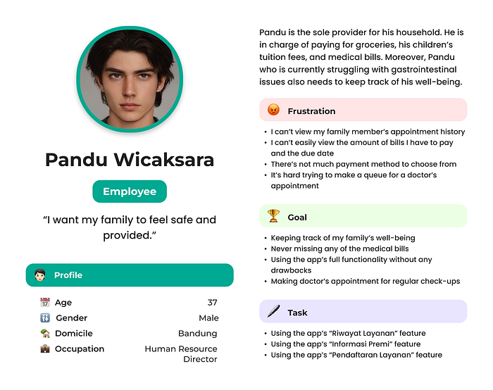
User Persona
Here are two user personas created based on the previous research and findings:
Casual User

Frequent User

Design Process
Information Architecture
Information architecture aims to organize, manage and structure information so that it can be accessed, understood and used efficiently. It focuses on the structure and layout of information in a system, website, application, or other information environment, where the goal is to ensure that users can easily navigate, search, and get the information they need.
Here is an updated information architecture for the redesign of the Mobile JKN application:

Low Fidelity Prototyping (Wireframing)
Wireframing is the process of creating a sketch or basic framework of the User Interface (UI) of a digital product, such as a website, mobile application, or software. The main goal of wireframing is to plan and describe the visual structure and layout of the main elements in a product design without paying attention to any visual details, colors, or decorative elements.
Here is an updated wireframe for the redesign of the Mobile JKN application:

You can access the redesign of Mobile JKN’s low fidelity prototype here.
High Fidelity Prototyping
High fidelity prototyping is used to describe how users will interact with the digital product. The goal is to test and validate the design concept, layout, workflow, and product functionality before developing the final version.
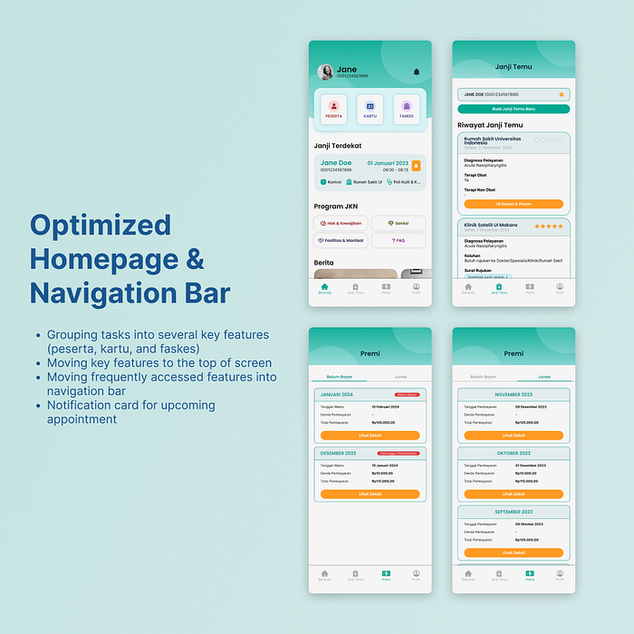
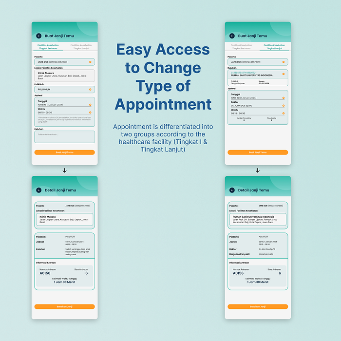
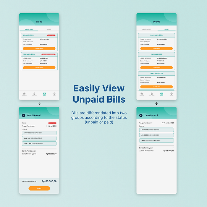
Here is an updated prototype for the redesign of the Mobile JKN application:


You can access the redesign of Mobile JKN’s high fidelity protoype here.
Testing
Another System Usability Scaling assessment was conducted to evaluate the redesigned Mobile JKN application. The evaluation yielded a score of 76.8, positioning it within the 83rd percentile compared to other applications in the database. This percentile rank indicates that the redesign outperforms 83% of the applications assessed, marking a significant improvement in usability.
Corresponding to this impressive score, the assessment classifies the Mobile JKN redesign with a B+ grade, denoting notable advancement in its usability. Additionally, it is deemed “acceptable,” acknowledging the substantial strides taken to enhance the application’s usability and user experience.
Closing
With this redesign, Mobile JKN has seamlessly integrated functionality and aesthetics. Its success lies not only in the numbers — a commendable 76.8 score and a B+ grade — but also in the tangible impact it has had on users. This revitalized interface has rekindled user enthusiasm, making the Mobile JKN application not just a tool but an overall enjoyable experience in performing a tedious every day task.
Thank you for reading!
